Monday, February 25, 2013

Envelope art: women pilots # 1

I've been reading a lot about women pilots lately, being one myself years ago. I'm especially reading about women who flew in WW2 as ATA pilots, and also the Nachthexen Russian female pilots who actually flew in combat. I've also been wanting to do more envelope art. I thought I'd combine the two, and do some sketches of women pilots etc.
 

The front side is one of the ATA pilots, peaking out the cockpit window, just before WW2. I know I have more details about the original publicity photo and the pilot in it somewhere, but am having trouble finding it. I'll repost it as soon as I do. I haven't put my penpal's address on the envelope yet, as I don't want to post that on the internet.

In the original photo, the woman looked very young and was smiling more broadly. I didn't quite draw her this way.  I've been reading how one in ten of the ATA (Air Transport Auxiliary) died, and how the women pilots had to prove themselves to be twice as good as the male flyers to be accepted as aviators. They often ferried the aircraft at huge personal risk, to get them to the combat pilots in dreadful weather and fog. They did this despite the fact that ATA pilots weren't taught to fly on the instruments (!!!) and radio navigation, like what we are used to using today, was not active over Britain because it would have helped the german attacking aircraft.  The ATA pilots were so amazingly brave. I think this is the reason I subconsciously drew her having a more serious smile, and being a little tireder. I suppose when we look at those old pre-war publicity shots, we see them with the hindsight of knowing what the people in the photos had in their future.

The back side is Beryl Markham's signature Vega Gull plane, crashed in the mud after a ground-breaking trans-Atlantic flight. She was shaken and bruised, but luckily able to walk away.


When drawing illustrations on envelopes, it is important to cut the sidetabs and fold the envelope first. It is quite difficult to remember to draw everything in the right spot or alignment if you don't. You can see from the photo below how you have to leave a space along the edge for the tabs.


These sketches were just done on recycled paper, bought from the $2 shop. Much cheaper than buying envelopes. Here is my earlier post on how to make envelopes from A4 paper.  I used an 0.05 black Staedler technical pen for both sketches.


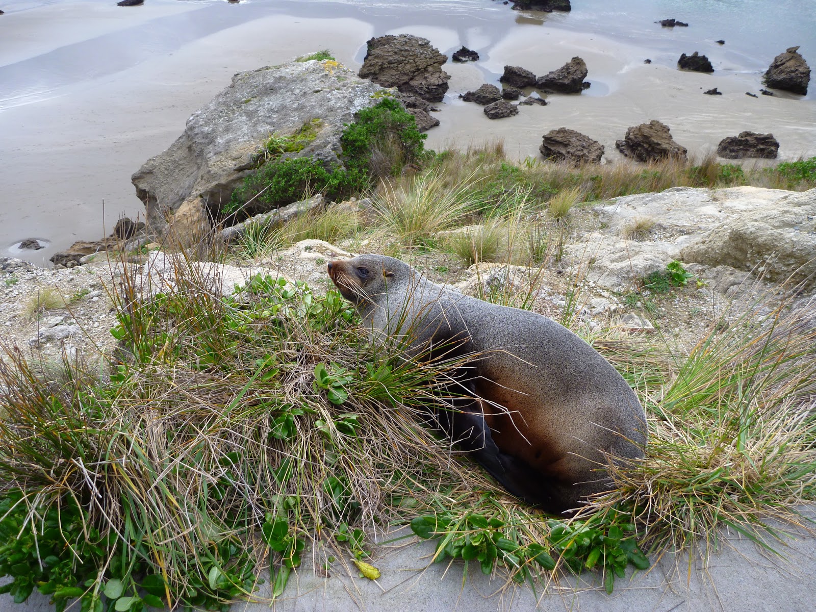
Somewhere near Opotiki?, North Island, New Zealand

Thursday, February 21, 2013

Derwent Onyx Pencil

I've finally had a chance to use my Derwent Onyx pencil that I ordered from the UK (from the Ken Bromley website). I ordered a Medium.


I did a very quick sketch using it in some random blank spot in my sketchbook - so not a formal work at all! You can see bits of other sketches on the side. It feels slightly different to an ordinary graphite pencil, as if it is harder but still smooth to sketch with. The Medium Onyx pencil can get quite dark, but only if you press down really, really hard (the very black marks in the picture are random marks from the fountain pen, not the Onyx pencil). They come in Medium or Dark, and I think next time I place I order, I will get the Dark Onyx pencil. I couldn't seem to replicate the dark shades that other people have achieved with the medium onyx pencil, and I was pressing pretty hard. I wanted to compare what this pencil is like compared to common soft graphite ones. I haven't  tried the Derwent graphites.

Pros: The point kept its shape for most of the sketch, so I will probably make this my go-to pencil for on-location sketches. I hate trying to sketch something quickly with a rapidly blunting pencil. It does smudge if you accidentally run your fingers across the drawing, but not to the same extent as a soft graphite pencil. The pencil marks erase well too. 

Cons: I tried blending with a blending stick, which does smudge the marks, but doesn't quite smudge the edges of the original marks (like it would if I used a soft graphite pencil). So I ended up still seeing the original marks clear as day, with the blending around them. If I was planning to blend, I would probably take more care to do very fine cross hatching. The blending stick didn't pick up much very colour from my attempts at blending either (like it would with a soft graphite pencil). One technique recommended by very fast sketchers is to pick up colour with the blending stick and do some of the drawing with that. I probably wouldn't plan to do that so much if I were using this pencil. But these are just very minor things, really.

Anyway, these are just some thoughts from an ordinary person. Professional artists' reviews are here and here.


 River near Dunedin, South Island, New Zealand

Tuesday, February 19, 2013

Noodlers Konrad Flex Pen

I did a few quick sketches to try out my new Noodlers Flex Pen. The flow of the ink and the flexibility of the nib depends on how the nib and the ink thingy (not sure if that is the technical term...) are aligned and how far in the pen you push them. This video explains it. I think I have sorted it out now, and am very happy with the pen.

I know that I am not really using the flex nib feature yet. I think as I use the pen more and more, I will instinctively use the flexing feature. I'm looking forward to practising that.

I did have thoughts of using the pen for fine copperplate calligraphy. I think now that the nib of the pen is a bit thick for copperplate writing (that is, if you are actually using it to write a letter or something, where you need the letters to be very small). So I will still use a traditional copperplate nib dip pen for that. For larger calligraphy it would be fine, I think. But I am looking forward to using the Noodlers pen for sketching anyway.
I also ordered the Noodlers Black Ink. I'm not an ink expert, but it has quite a different feel to it than Winsor & Newton ink that I have used previously. It is so black, it is almost startling to put on the page. I can understand now why people use the ink fountain pens, so they can use these inks, rather than just felt-tip pens, although obviously there is a place for both. I will definitely be ordering more Noodlers ink, possibly in a sepia colour next time.


When using the Noodlers Flex pen, you almost get 3 thicknesses. The very fine line when you move the pen sideways to the nib, the fine line when you move the pen in the direction of the nib, and the variable thickness when you actually press the nib down to split the nib. So I think it is a very versatile pen to have.

************************

Oh dear, hold the phone... I have, too late, alas, discovered one of the flaws of the Konrad pen. There is not a lot of room in the lid - a approx a micro-nano-meter between the nib ending and lid beginning. If you have the nib in any position other than at, or near, its furthest into the pen, you run the risk of bending the nib when you screw the cap on.  Unfortunately, I had the nib a bit further out, as per the video instructions, as that was the only setting where the pen did not gush too much ink (especially when flexed). Bit disappointed with that. Luckily I think I have been able to bend the nib almost back to its original position (kinda, but not quite, grr grr grr), but this does mean that with the nib further in, the pen gushes more ink that I would like. I've tried having the black ink rod slightly askew from the nib, but this hasn't  made any noticeable difference. I do notice that if I store the pen, nib end up, this does seem to make it gush a bit less when I use it. There is always the option of moving the nib out each time I use it, but while possible, this is a very messy procedure, and not really one that I want to do every time, if I can avoid it. The pen is still useable, but when you flex the nib to get a thicker line, and then cease flexing it (to try and get a thinner line again), the ink still comes out so much that the line remains thick. Anyway, I will keep using it, and we'll see if it comes right.


Friday, February 15, 2013

Sketching at a Medieval Tournament

I went to the Wellington Sketchers meetup at the biannual Harcourt Park World Invitational Jousting Tournament. The weather was a beautiful, calm sunny day, and we had a great time. 


There were many people from the Order of the Boar, the Shire of Darton ( from the Society for Creative Anachronism), and other historical reenactment groups. Everyone there had gone to so much effort, it was amazing. A medieval village was also set up, where many people were camping in costume for the weekend.
 

Above: A lady works a historically accurate loom in the medieval village. The circles at the bottom are weights. She very kindly told me some of the history of weaving and textile arts. Her friend below also very kindly let me sketch her.


There were so many things to sketch at this event, it was hard to choose. The great thing is that people who are dressed up in medieval costume are aware that people will want to take photos of them. So I felt a lot more comfortable asking people if I could sketch them. Everyone I asked said yes, and I could therefore sit close enough to comfortably sketch them.  Here is the lady at the loom taking a photo of my sketch of her afterwards.


 I also sketched at the lathe and woodworking area. This was a great area to sketch, as when someone is engaged in some sort of work they return to the same position frequently, making it easier to sketch them. Below is a sketch of a man who was showing people how medieval lathes and woodworking worked. He and is family were staying their all weekend and cooking using medieval methods. I was going to sketch his wife cooking, but unfortunately ran out of time. I was very thankful that he let me sketch him working for so long!

Quentin carving the wooden rests, which are part of the lathe.


He demonstrated how to use the medieval lathe, turned by moving one's foot up and down, thereby moving the string attached to the long stick about his head - I am not sure how it worked after that. The one where he is sitting is a medieval woodworking clamp. He built all these himself. Onlookers were always a bit shy at first, like the guy I drew above, but all the people in the medieval village were very welcoming and put people at ease to ask questions.

A small stool constructed using medieval methods.

I did the painting at the event for the first time, with quite a few people looking over my shoulder. A few people came up and spoke to me, and one little girl came up, all dressed in medieval costume, told me all about her drawings and her big brother at home, which was sweet.

The tiny girl who came up and spoke to me as I was sketching. 
This was done with Noodlers Black Ink and Copperplate Dip Pen Nib in a wooden holder. 
This is the only sketch in this post that I did at home.


My next plan is to re-sketch some of these sketches as if they were medieval woodcuts. I'm still researching the right eras, the hatching style, and the distortions of perspective etc to be able to re-sketch them in a medieval woodcut style.

Things I learnt about urban sketching today:

When sketching people so close up, I didn't draw my usual stick figure of their pose, thinking that as they were sitting there for a while I would have enough time. I think I should have. Although people unconsciously return to a pose frequently, their stance can be slightly different, but look so similar that you kind of don't notice until afterwards (should that arm really be over there??). I was caught out a few times, where I drew something that didn't quite match with the original pose. That's OK - practise practise practise. I think it is best to catch the original pose as a stick/shape figure asap, and then fill out the details when they return to each pose.

As I am working fast, and completely in pen (no safety net!), when I say ¨draw a stick figure¨, I kind of just do it in quick dots & fine dashes rather than firm lines, and then these marks would just blend into the final pen drawing without being too noticeable.

I also found that when doing work in pencil, the speed of the work means that the pencil is blunt about half way through. I think I should use my Derwent Onyx pencil when drawing on location next time, which stays sharp much longer, or have a sharpener out and ready before I start sketching. I am getting an idea of what size paper and pen combination I like to work with, which is great. With the exception of the little girl above, these were all done on location in an 15cm x 18cm sketchbook, with 0.05 technical pen.


Tuesday, February 12, 2013

Sketching at British Car Day


Restoring classic and vintage cars is amazingly popular here. I am not sure if it is just a Hutt Valley thing, but even in the small amount of driving that I do, I would see on average between 2-6 classic, beautifully restored cars being driven on the road almost every day. I find that quite remarkable.

Original sketch: about 3cm tall, 0.05 technical pen on $2 Shop paper.

British Car Day is apparently an annual thing, held around the same time of year as American Vehicle Day,  but I had never been to either before. There was an amazing number of classic cars at Trentham Park on this gorgeous summer day. I wonder if there is a bit of a link between sketching these cars (rather than taking a photo) and the restoration of classic cars (rather than buying a new car off the line): neither is a fast, run-of-the-mill process.

Original sketch: about 4cm tall, 0.05 black Staedler technical pen on $2 shop paper. 
I was really happy with the people in this sketch: the guy strolling around, the guy comparing cars to his notes, 
the proud owner with his hands on his hips, the friend chatting and looking about.

Sketching-wise, the weather was great and I could have spent a week sketching there. But I didn't find it an easy afternoon. The sun was really very, very hot, and I ended up doing my main sketching in the visitors car park just to be in some shade. (This sounds counter-productive, but many people who came to look at British Car Day drove there in their ¨other¨ classic car, so even car park had heaps of great cars too, although I think that meant I probably wasn't actually sketching a British car then...).

I also found that with the cars in the event parked in semi-circles, to sit and sketch them from the front would mean that I would be sitting in the main thoroughfares, rather than being tucked away in a corner. I wasn't worried about sketching per se - I was fairly confident that if I had said to anyone there, hey can I sketch you in front of your car, they would have happily let me and told me all about themelseves and their vehicle, and probably have called their friends over to have their car sketched too. It was more that I still wasn't confident that my sketch would be any good, and therefore didn't want to draw attention to myself. ;o) I was on my own this afternoon, and I think I would have felt better if I were sketching with a group.

Original size: 15cm x 25 cm, Pitt Fine pen, $2 Shop paper


So I kind of pieced together cars, people & bits from different scenes, took a photo of the backgrounds I missed sketching and tidied it up at home, and did the painting at home. I don't feel that I captured the sheer size of the event either - with the exception of the sketch below, each of my sketches could have had another 5-10 cars in it. From an urban sketching point of view, not my most successful outing! But probably good practice for next year anyway. I'm still glad I went.

The sketch below is the only one that I did 100% from start to finish at the event, as this was one car where I could actually sketch it at leisure tucked away in the shade, out of the thoroughfare. I don't think it was a British car though.

Original size: A4. Pitt pen, black, size Fine.


Blog Badge


Monday, February 11, 2013

On the Spot Drawing

I had an amazing stroke of luck the other day in a secondhand bookstore in town. I was glancing through the art section, and on my final look through before turning to leave, I spotted the book On the Spot Drawing by Nick Meglin. It was written in 1965, and looks like it could have been a groundbreaking basis to the modern on-location sketching movement, and probably urban sketching. It was written around the time that on-the-spot sketches were still used in newspapers and magazines, but where photography was gradually overtaking it. The book has several artists talking about different aspects of their on-location sketches, reportage, and the importance of being there. Obviously reportage and on-location drawing had been around for ages, but the idea of popularising it, and seeing it as something valuable in its own right (rather than as a precursor to painting) was really interesting. The artists also talked about how they used different styles of styles of sketching, medium, layout, and mark making depending on the subject matter and the emotion of the scene; which is something I am really interested in.  The different artists had some fascinating things to say about it all, all in the backdrop of 1965 America, and I read it cover to cover.

Wainui Bay, Tasman District, South Island, New Zealand

Saturday, February 2, 2013

Campervan sketches


A couple of sketches from photos in a book, so not from real life. I'm practising line drawings again, which I'm quite enjoying. I usually see things so much as a range of tones, it is often quite difficult (for me) to translate images to mere lines. 

A gratuitous photo of a seal, which we saw at Castelpoint, North Island, New Zealand